CASE STUDY

Kalcer.ID

A comprehensive cultural hub bridging fragmented heritage sites into one unified platform with dynamic event discovery.

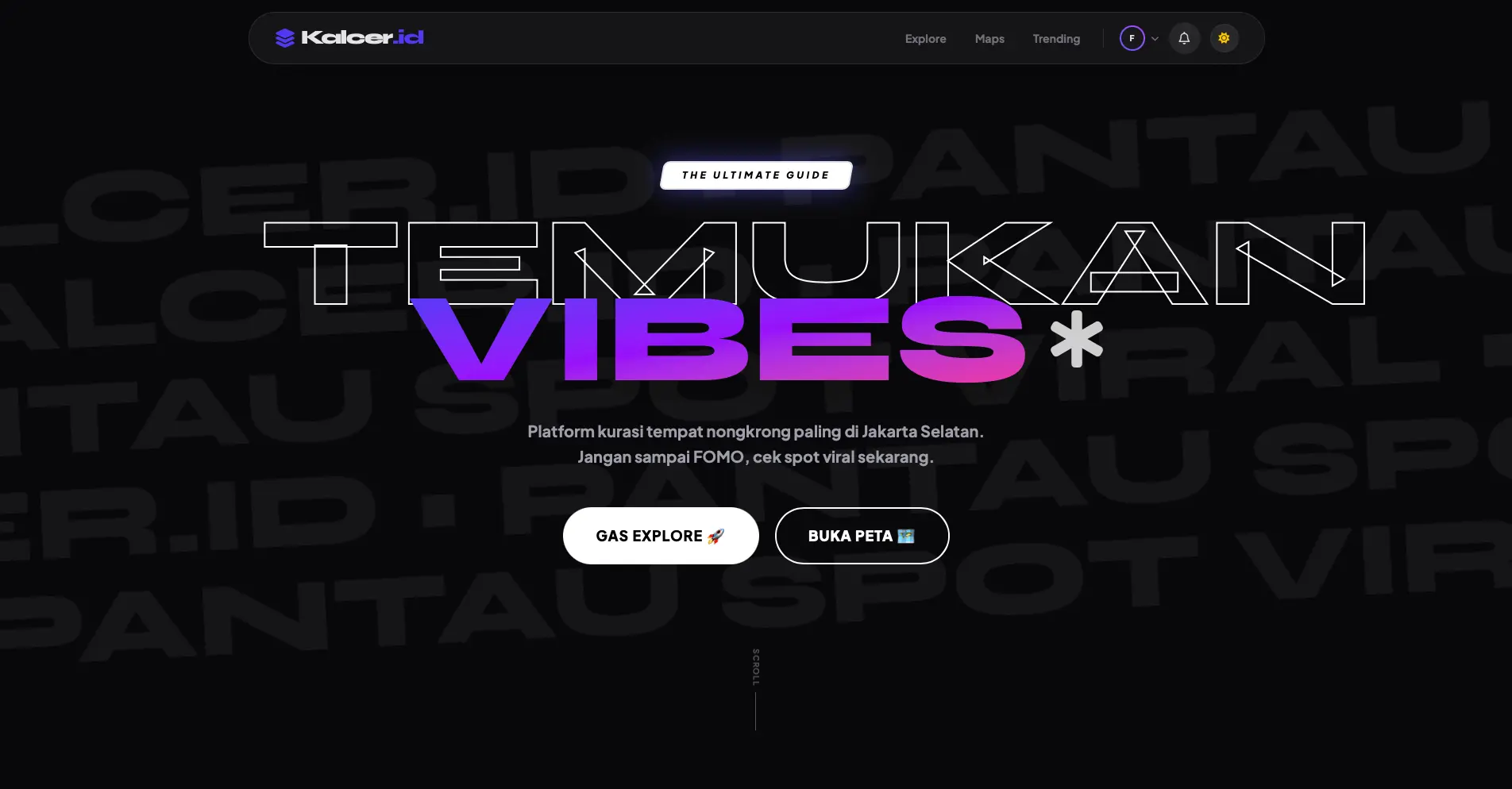
Kalcer.ID Hero Image
01

The Problem

Cultural engagement and heritage tourism were declining due to highly fragmented information sources. Potential visitors found it difficult to discover authentic local events, workshops, and historical sites in one seamless platform, reducing overall participation in community-driven cultural activities.

02

Research & Insights

Extensive interviews with local guides, tourists, and cultural preservationists revealed a profound information gap, rather than a lack of interest.

Insight 1

Users abandon discovery platforms if bookings and event schedules are stored on completely separate apps.

Insight 2

Visual storytelling is critical; high-quality imagery of the culture is required to build initial interest.

01
Task 1 — Dual User Flow Architecture

Journey Maps · Two Roles, Two Worlds

Flow A maps the end-user's discovery journey from emotional browsing to community contribution. Flow B maps the business owner's operational cycle from analytics to active listing management.

Flow A · End-User
Explore → Discover → Act → Contribute
Mobile-first path
flowchart TD A([User opens Kalcer.ID]) --> B[Explore Feed loads
Personalised cards: trending nearby
Location permission requested] B --> C{Location permitted?} C -- Yes --> D[Feed ranked by proximity and trending score
Geolocation-aware cards] C -- No --> E[Feed ranked by general trending
Prompt to enable location later] D --> F E --> F[User browses Hangout Cards
Image - Name - Verified badge - Open/Closed - Rating] F --> G{Interaction type?} G -- Search intent --> H[Tap search bar
Type keyword or category
Instant live results filter] G -- Filter intent --> I[Tap filter chips
Category / Open Now / District / Vibe
Results update without page reload] G -- Curious tap --> J H --> J[Hangout Detail Page
Hero image full-bleed
Name + Verified + Category] I --> J J --> K[User reads operational hours
Open/Closed status badge
Schedule table if tapped] K --> L[User scrolls to Reviews section
Reads community ratings
Photo reviews visible] L --> M{User intent?} M -- Save for later --> N[Tap Bookmark icon
Heart animation plays
Added to Wishlist instantly] N --> O[Toast: Saved to your Wishlist
No account? Soft prompt to sign up
Guest can bookmark with local storage] O --> P{User logged in?} P -- No nudge --> Q[Non-intrusive banner
Sign up to keep your saves forever
Dismissable not blocking] P -- Yes --> R M -- Check in --> S{User logged in?} S -- No --> T[Auth wall with context
Log in to check in at this spot
Sign up or continue as guest] T --> U[Auth Flow
Email / Google / Phone OTP
Fast under 3 screens] U --> S S -- Yes --> V[Tap Check In button
Confirmation sheet slides up
Venue name + timestamp + optional photo] V --> W[Check-in confirmed
Badge added to user profile
Venue check-in count increments] W --> R M -- Leave a review --> X{User checked in or visited?} X -- Yes --> Y[Review Composer
Star rating 1 to 5
Text field: What made this spot special?
Photo upload optional] X -- No prompt --> Z[Soft gate: Have you visited this place?
Two options: I have been here or Just sharing thoughts
Both paths allowed] Z --> Y Y --> AA[Submit review
Moderation flag check
Review appears after brief delay] AA --> AB([Review live and Profile updated
XP badge earned if gamification enabled]) R --> F style A fill:#E8552A,color:#fff,stroke:none style AB fill:#2D9B6F,color:#fff,stroke:none style C fill:#F7F3EE,color:#7A6B5D,stroke:#E8552A style G fill:#F7F3EE,color:#7A6B5D,stroke:#E8552A style M fill:#F7F3EE,color:#7A6B5D,stroke:#F5A623 style P fill:#F7F3EE,color:#7A6B5D,stroke:#F5A623 style S fill:#F7F3EE,color:#7A6B5D,stroke:#2D9B6F style X fill:#F7F3EE,color:#7A6B5D,stroke:#2D9B6F style N fill:#f0fdf4,color:#166534,stroke:#2D9B6F style W fill:#f0fdf4,color:#166534,stroke:#2D9B6F style T fill:#fff7ed,color:#9a3412,stroke:#F5A623 style Q fill:#fff7ed,color:#9a3412,stroke:#F5A623
Flow B · Business Owner
Login → Analytics → Manage Listing → Publish
Desktop-first path
flowchart TD BA([Business Owner accesses Kalcer.ID Business Portal]) --> BB[Login screen
Email + password OR Google Business account] BB --> BC{Account verified?} BC -- Pending --> BD[Verification pending screen
Your venue is under review 24 to 48h
Email notification queued] BC -- Verified --> BE[Business Dashboard loads
KPI cards: Views Check-ins Reviews Saves
Notification bell with alerts] BE --> BF{Notifications present?} BF -- Yes --> BG[Owner reads notification tray
New reviews to respond to
Profile completion prompts System alerts] BG --> BH[Owner taps review notification
Review Response Panel
Shows star rating and user comment] BH --> BI[Owner types public response
Thank you for visiting
Submit response appears below review] BF -- None --> BJ BI --> BJ[Owner navigates to My Venue management section] BJ --> BK[Venue Editor loads
Current details shown in editable form
Last updated timestamp visible] BK --> BL{What to update?} BL -- Operational Hours --> BM[Edit hours table
Day-by-day toggle On/Off
From/To time picker · Holiday exception dates] BM --> BN[Preview shows how it appears to end-users
Opens 10:00 AM
Save Hours update live on platform] BL -- Images --> BO[Image Manager
Drag-and-drop upload zone
Existing images in grid with delete X
Set cover photo by dragging to first slot] BO --> BP[Image compression auto-runs
Alt-text field optional
Max 10 images per venue] BP --> BQ[Save New images live immediately
Old cover replaced with fade transition] BL -- Venue Info --> BR[Edit form
Venue name Description Category
Address Social links Vibe tags] BR --> BS{Changes pass validation?} BS -- Missing required fields --> BT[Inline errors highlighted in red
Scroll to first error auto
No data loss on validation fail] BS -- Valid --> BU[Save draft OR Publish immediately] BU --> BV[Change log entry created
Admin moderation for sensitive fields
Minor edits go live instantly] BN --> BW BQ --> BW BV --> BW[Venue page updated
Success toast: Your venue is live
Dashboard analytics refresh] BW --> BX([Session complete
Changes reflected on explore feed
Owner can preview public page]) style BA fill:#0E8A7A,color:#fff,stroke:none style BX fill:#2D9B6F,color:#fff,stroke:none style BC fill:#F7F3EE,color:#7A6B5D,stroke:#0E8A7A style BF fill:#F7F3EE,color:#7A6B5D,stroke:#F5A623 style BL fill:#F7F3EE,color:#7A6B5D,stroke:#0E8A7A style BS fill:#F7F3EE,color:#7A6B5D,stroke:#2D9B6F style BD fill:#fff7ed,color:#9a3412,stroke:#F5A623 style BT fill:#fef2f2,color:#991b1b,stroke:#DC3545 style BN fill:#f0fdf4,color:#166534,stroke:#2D9B6F style BW fill:#f0fdf4,color:#166534,stroke:#2D9B6F
User entry / action node
Business owner entry
Success / completion
User decision node
System / auth check
Friction / nudge state
Validation error
02
Task 2 — Wireframe Screen Blueprints

Screen-by-Screen Architecture

Four annotated blueprints built around the demographic reality: Gen-Z users who expect aesthetic density, social signals everywhere, and zero friction between curiosity and action.

S1

Explore Feed / Homepage

Scannable cards · Verified badges · Instant bookmark · Aesthetic-first grid

Mobile · 390px
Card tap = detail
Verified = API badge
Open = live hours
🔝 Header Zone — Sticky

Minimal nav + search always visible

  • Logo: Kalcer.ID wordmark left-aligned. Syne 800, coral accent on the period. 28px height.
  • Right cluster: Notification bell (coral dot badge for unread) + Location pin icon. 44×44px tap targets.
  • Sticky behaviour: Nav stays pinned. On scroll down, nav subtly reduces height (56px → 44px) and gains a frosted warm-white background blur.
🔍 Search Bar

Persistent, rounded, always above fold

  • Full-width pill (48px height, 100px radius). Soft paper background, warm border. Magnifier icon left (14px, coral). Placeholder: "Search cafés, venues, vibes…"
  • On focus: border turns coral, keyboard-aware scroll locks search bar near top.
  • Livewire-powered: triggers real-time results with 300ms debounce — no submit button needed.
🏷️ Filter Chips

Horizontal-scroll category row

  • Chips: "All" / "Café" / "Bar" / "Rooftop" / "Open Now" / "Near Me" / "Under 50K" — extend off-screen (overflow scroll, no scrollbar visible).
  • Active chip: coral fill, white text. Inactive: paper bg, faint border, muted text.
  • Multiple chips selectable simultaneously (filter stack). Active count badge on filter icon if >2 active.
  • Selecting a chip updates feed in-place — no page reload. Livewire reactive component.
🃏 Hangout Place Cards — The Core Component

Transforming dense data into scannable visuals

  • Card anatomy: Hero image (variable height, 3:2 ratio) → category chip overlay (bottom-left) → bookmark icon (top-right, always accessible) → Info section below image.
  • Info row 1: Venue name (Syne 600, 14px, ink) + Verified badge (if applicable) — right-aligned green pill with checkmark dot.
  • Info row 2: Open/Closed pill (semantic color) + Star rating (filled amber stars) + Check-in count ("128 check-ins" as social proof).
  • Bookmark icon: Persists on top-right of image overlay at all times. Tap: heart fill animation, immediate optimistic UI, syncs to Livewire. No login required for local save.
  • Verified badge: Only renders when is_verified = true. Green dot + "Verified" text. Never faked. Builds trust signal instantly.
📐 Feed Layout Rhythm

Editorial mixed-grid — not a boring uniform list

  • Pattern (repeating): 1 wide featured card (full-width, taller image) → 2-column grid (2 cards) → 1 wide card → 2-column → etc. Creates visual rhythm without clutter.
  • Featured card trigger: Top-rated / most check-ins in last 24h. Slightly larger image. Editorial feel — like a magazine cover pick.
  • Card corner radius: 14px. Subtle drop shadow (4px blur, 8% ink). Hover on desktop: scale(1.01) + shadow increase.
Empty state copy (no results) "No spots match your vibe right now. Try a different filter — or be the first to discover something new nearby."
⬇️ Tab Bar — 4 items max

Thumb-zone persistent navigation

  • Tabs: Explore (home) · Map View · My Wishlist · Profile. 4 items maximum — no hamburger.
  • Active tab: icon turns coral + small coral dot below. Inactive: grey icon.
  • Sticky bottom, above system gesture bar. Safe area padding applied.
S2

Hangout Detail Page

Hero image · Live hours indicator · Check-in CTA · Community reviews

Mobile · Full Page
Livewire hours
Check-in logged
Review moderated
🖼️ Hero Image Zone

Full-bleed top, edge-to-edge on mobile

  • Height: 280px on mobile. Full viewport width. No horizontal padding — image extends to screen edges for an immersive feel.
  • Gradient overlay: Bottom 50% fades to semi-transparent ink (0.55 opacity). Venue name and metadata sit on this gradient — always legible regardless of image color.
  • Back button: Top-left, 40×40px circle, frosted white. Tap returns to feed at scroll position (no full reload — Livewire maintains state).
  • Bookmark button: Top-right, same frosted circle. Coral fill when saved. Always accessible — no scroll required.
  • Bottom of hero: Venue name (Syne 700, 20px, white) + category tag + Verified badge (if applicable).
⏰ Operational Hours Indicator

The critical information hierarchy moment

  • Status pill (top of info section): "Open Now" = green pill / "Closed" = red pill / "Opens at 6PM" = amber pill with time. This is the first piece of info after scrolling past hero — before anything else.
  • Hours card: Shows today's hours by default ("Today: 10:00 — 22:00"). Expandable: tap to show full weekly schedule as a day-by-day table.
  • Livewire-reactive: Status updates dynamically based on server time — no stale "Open" badges. Connected to operational_hours model already coded.
Hours status copy examples "Open Now · Closes at 10:00 PM" "Closed · Opens tomorrow at 10:00 AM" "Opening soon · Opens in 45 minutes"
📍 Check-In Button

Primary CTA — bold, single, always visible

  • Full-width, 52px height, 100px radius: Coral gradient fill. Label: "Check In Here 📍" — Syne 700, 15px, white. This is the primary action on the page.
  • Tapping while logged out: Bottom sheet slides up with auth prompt — not a hard redirect. User sees check-in confirmation waiting for them on the other side of login.
  • After check-in: Button transforms to "✓ You checked in" with a green fill. Counter below increments: "Now 129 people have been here." Social proof loop.
  • Second check-in same day: Button disabled, label: "Already checked in today." Prevents spam.
⭐ Reviews Section

Community-first, photo-friendly, contributor-rewarding

  • Section header: "What people are saying" (Syne 600, 16px) + "Write a Review" pill button (coral, right-aligned).
  • Rating summary bar: Large average score (Syne 800, 32px, coral) + star visual + breakdown (5★ 60% / 4★ 25% / etc.) as horizontal fill bars. Scannable at a glance.
  • Review cards: Reviewer avatar + username + date + star rating + text + optional photo thumbnail. Card shadow: subtle warm. "Helpful?" thumbs up below.
  • Photo reviews: Show a horizontal scroll of user-submitted photos above the text reviews. Like Instagram highlights. Younger users respond strongly to UGC imagery.
  • Review composer: Opens as full-screen overlay. Star tap → text input → photo upload (optional) → submit. All within 3 interactions.
S3

User Profile & Wishlist

Saved places grid · Check-in history · Personal discovery identity

Mobile · Profile Tab
+
2-tab switcher
Wishlist = bookmarks
Stats = gamification
👤 Profile Header

Identity card — dark ink background for contrast pop

  • Background: Deep ink card (not the page background) — creates a "card within page" effect. Makes the profile feel premium.
  • Avatar: 56px circle. Editable — tap opens image picker. Initials fallback if no photo set.
  • Username + @handle: Syne 700 + Outfit 400. Handle in muted white — discoverable identity.
  • Edit icon: Top-right gear/pencil. 40×40px. Opens inline edit mode (no new page).
📊 Stats Strip — Social Proof + Gamification

3-cell row below profile header

  • Cells: Saved Places count (coral) · Check-ins count (green) · Reviews Written (amber). Numbers in Syne 700, 20px. Label below in 11px muted.
  • Tapping a stat cell jumps to that section (e.g., tapping "12 Check-ins" scrolls to check-in history).
  • These stats are the gamification loop — users are motivated to increase their numbers. No complex badge system needed at V1.
📑 Tab Switcher — Wishlist ↔ Check-ins

Segmented control, not separate pages

  • Pill-style toggle: "Saved Places" | "My Check-ins". Active pill: paper bg, coral text, border. Inactive: flat, muted.
  • Content switches without navigation — Livewire conditional rendering. No scroll-to-top on switch.
🔖 Wishlist Grid — "Saved Places"

2-column card grid — visual, not a list

  • Card anatomy: Thumbnail image (48px height, gradient fallback) + venue name + category tag. Square format. 11px radius.
  • Long-press action: Hold on a card → context menu: "Visit page" / "Remove from wishlist" / "Share." Avoids cluttering the card UI with extra buttons.
  • Empty slot card: Dashed border, soft coral "+" icon centered. Tapping jumps to Explore Feed. Solves empty state UX gracefully.
  • Sort options: Small "Sort" chip top-right of section: "Recently Saved" / "Alphabetical" / "Most Visited." Default: recently saved.
📍 Check-in History List

Horizontal card with thumbnail, name, date, badge

  • Row anatomy: Square thumbnail (36px, venue cover image or gradient fallback) + venue name + check-in date ("Yesterday", "Mar 10") + coral count badge (how many times visited).
  • Multiple check-ins to same venue collapse: "Visited 3×" badge instead of 3 separate rows.
  • Tapping a row opens the venue's detail page (same Livewire component re-rendered).
  • Empty state: "Your adventures start here — check in somewhere!" with Explore CTA button.
Profile stat labels "Saved Places" · "Check-ins" · "Reviews"
S4

Business Owner Dashboard

Venue analytics · Listing management · Review responses · Image & hours editor

Desktop · 1280px+
🗂️ Layout Structure

Dark sidebar + light main content — clear role separation

  • Sidebar (160px fixed, ink background): Kalcer.ID coral logo mark top. Nav: Dashboard · My Venue · Reviews · Analytics · Images · Hours · Settings. Icon + label. Bottom: Profile + Logout.
  • Topbar (56px, warm background, sticky): Page title left. Right: Notification bell (amber badge for new reviews) + "Preview my listing →" button (coral outline) + avatar.
  • "Preview listing" CTA is unique to the business portal — lets owner see exactly how their page appears to end-users. Critical feedback loop.
🔔 Notification / Alert Strip

Amber strip for pending actions — renders before KPIs

  • Only renders when actionable items exist: new reviews awaiting response, incomplete listing fields, verification pending, operational hours not set.
  • Format: amber dot + description text + "Review now →" button (amber fill). Dismissable.
  • This is the equivalent of the 4h admin drain fix for business owners — they see exactly what needs doing first.
📊 KPI Cards — 3 Core Metrics

Top-border semantic color system

  • Card anatomy: 2.5px top border (semantic color) + label (11px muted) + large number (Syne 700, 26px) + delta chip ("↑ 14% this week").
  • 🔴 Coral: "Profile Views" — primary visibility metric.
  • 🟢 Green: "Total Check-ins" — community engagement proof.
  • 🟡 Amber: "Reviews this month" — reputation health signal.
  • Each card clickable → navigates to detailed breakdown view.
📈 Analytics Chart

7-day views chart (60% width) + Recent Reviews (40%)

  • Bar chart: Profile views per day. Coral bars. Amber bars for days with <50% of average. X-axis: abbreviated day names. Y-axis: minimal — only max value shown.
  • Review feed panel: Last 3 reviews shown as compact cards. Star rating + truncated text + "Respond" coral button. Clicking opens full response composer in a side panel (no page nav).
🏢 Venue Management Sections

Four distinct editor zones (sidebar nav items)

  • My Venue (info editor): Single-column form with sections: Basic Info (name, category, description) / Location / Contact / Vibe Tags. Auto-saves on field blur — no "save" button anxiety. Unsaved indicator chip top-right if changes pending.
  • Operational Hours: Table-style editor: rows for each day. Toggle switch (On/Off) left. From/To time pickers right. "Copy to all days" quick action. Holiday dates section below. Saves in real-time via Livewire, reflects on public page instantly.
  • Image Manager: Drag-and-drop grid. Cover photo = first slot (labelled). Max 10 images. Reorder by dragging. Delete on hover (X overlay). Upload progress bar per image. Accepted: JPG/PNG/WebP under 5MB.
  • Review Management: Full review table with filter (All / Responded / Unanswered). Each row: user, rating, date, snippet. "Reply" button opens inline text field below row — contextual, no modal.
Auto-save indicator copy "Changes saved automatically · Last saved just now"
Verification pending state copy "Your venue is under review by our team. This usually takes 24–48 hours. We'll email you at [address] when it's live."
05

UI Design & Outcomes

The resulting interface embraces a vibrant yet structured aesthetic, using bold typography to highlight Indonesian culture while maintaining a high standard of modern usability.

Colors

UX Improvements

  • Centralized event ticketing
  • Interactive heritage mapping
  • Bite-sized article browsing

Stack Used

  • Figma for Prototyping
  • React + Tailwind
  • Headless CMS
06

Prototype & Outcome

The unified platform successfully mapped fragmented cultural events into a single, cohesive discovery experience.

Want to see it in action?

Live App (Kalcer.ID)
flowchart TD A([User opens Kalcer.ID]) --> B[Explore Feed loads
Personalised cards: trending nearby
Location permission requested] B --> C{Location permitted?} C -- Yes --> D[Feed ranked by proximity and trending score
Geolocation-aware cards] C -- No --> E[Feed ranked by general trending
Prompt to enable location later] D --> F E --> F[User browses Hangout Cards
Image · Name · Verified badge · Open/Closed · Rating] F --> G{Interaction type?} G -- Search intent --> H[Tap search bar
Type keyword or category
Instant live results filter] G -- Filter intent --> I[Tap filter chips
Category / Open Now / District / Vibe
Results update without page reload] G -- Curious tap --> J H --> J[Hangout Detail Page
Hero image full-bleed
Name + Verified + Category] I --> J J --> K[User reads operational hours
Open/Closed status badge
Schedule table if tapped] K --> L[User scrolls to Reviews section
Reads community ratings
Photo reviews visible] L --> M{User intent?} M -- Save for later --> N[Tap Bookmark icon
Heart animation plays
Added to Wishlist instantly] N --> O[Toast: Saved to your Wishlist
No account? Soft prompt to sign up
Guest can bookmark with local storage] O --> P{User logged in?} P -- No nudge --> Q[Non-intrusive banner
Sign up to keep your saves forever
Dismissable — not blocking] P -- Yes --> R M -- Check in --> S{User logged in?} S -- No --> T[Auth wall with context
Log in to check in at this spot
Sign up or continue as guest] T --> U[Auth Flow
Email / Google / Phone OTP
Fast — under 3 screens] U --> S S -- Yes --> V[Tap Check In button
Confirmation sheet slides up
Venue name · timestamp · optional photo] V --> W[Check-in confirmed
Badge added to user profile
Venue check-in count increments] W --> R M -- Leave a review --> X{User checked in or visited?} X -- Yes --> Y[Review Composer
Star rating 1 to 5
Text field: What made this spot special?
Photo upload optional] X -- No prompt --> Z[Soft gate: Have you visited this place?
Two options: I have been here or Just sharing thoughts
Both paths allowed] Z --> Y Y --> AA[Submit review
Moderation flag check
Review appears after brief delay] AA --> AB([Review live · Profile updated
XP / badge earned if gamification enabled]) R --> F style A fill:#E8552A,color:#fff,stroke:none style AB fill:#2D9B6F,color:#fff,stroke:none style C fill:#F7F3EE,color:#7A6B5D,stroke:#E8552A style G fill:#F7F3EE,color:#7A6B5D,stroke:#E8552A style M fill:#F7F3EE,color:#7A6B5D,stroke:#F5A623 style P fill:#F7F3EE,color:#7A6B5D,stroke:#F5A623 style S fill:#F7F3EE,color:#7A6B5D,stroke:#2D9B6F style X fill:#F7F3EE,color:#7A6B5D,stroke:#2D9B6F style N fill:#f0fdf4,color:#166534,stroke:#2D9B6F style W fill:#f0fdf4,color:#166534,stroke:#2D9B6F style T fill:#fff7ed,color:#9a3412,stroke:#F5A623 style Q fill:#fff7ed,color:#9a3412,stroke:#F5A623
-8" /> Kalcer.ID - UI/UX Case Study
CASE STUDY

Kalcer.ID

A comprehensive cultural hub bridging fragmented heritage sites into one unified platform with dynamic event discovery.

Kalcer.ID Hero Image
01

The Problem

Cultural engagement and heritage tourism were declining due to highly fragmented information sources. Potential visitors found it difficult to discover authentic local events, workshops, and historical sites in one seamless platform, reducing overall participation in community-driven cultural activities.

02

Research & Insights

Extensive interviews with local guides, tourists, and cultural preservationists revealed a profound information gap, rather than a lack of interest.

Insight 1

Users abandon discovery platforms if bookings and event schedules are stored on completely separate apps.

Insight 2

Visual storytelling is critical; high-quality imagery of the culture is required to build initial interest.

01
Task 1 — Dual User Flow Architecture

Journey Maps · Two Roles, Two Worlds

Flow A maps the end-user's discovery journey from emotional browsing to community contribution. Flow B maps the business owner's operational cycle from analytics to active listing management.

Flow A · End-User
Explore → Discover → Act → Contribute
Mobile-first path
flowchart TD A([📱 User opens Kalcer.ID]) --> B[Explore Feed loads Personalised cards: trending nearby Location permission requested] B --> C{Location permitted?} C -- ✅ Yes --> D[Feed ranked by proximity + trending score Geolocation-aware cards] C -- ❌ No --> E[Feed ranked by general trending Prompt to enable later stays visible] D --> F E --> F[User browses Hangout Cards Image · Name · Verified badge · Open/Closed · Rating] F --> G{Interaction type?} G -- 🔍 Search intent --> H[Tap search bar Type keyword or category Instant live results filter] G -- 🎯 Filter intent --> I[Tap filter chips: Category / Open Now / District / Vibe Results update without page reload] G -- 👆 Curious tap --> J H --> J[
Hangout Detail Page
Hero image full-bleed Name + Verified + Category] I --> J J --> K[User reads operational hours Open/Closed status badge Schedule table if tapped] K --> L[User scrolls to Reviews section Reads community ratings Photo reviews visible] L --> M{User intent?} M -- 🔖 Save for later --> N[Tap Bookmark icon Heart animation plays Added to Wishlist instantly] N --> O[Toast: 'Saved to your Wishlist ✓' No account? → Soft prompt to sign up Guest can still bookmark with local storage] O --> P{User logged in?} P -- No → nudge --> Q[Non-intrusive banner: 'Sign up to keep your saves forever' Dismissable — not blocking] P -- Yes --> R M -- 📍 Check in --> S{User logged in?} S -- No --> T[Auth wall with context: 'Log in to check in at this spot' Sign up or continue as guest info] T --> U[
Auth Flow
Email / Google / Phone OTP Fast — under 3 screens] U --> S S -- Yes --> V[Tap 'Check In' button Confirmation sheet slides up: Venue name · timestamp · optional photo] V --> W[Check-in confirmed ✅ Badge added to user profile Venue's check-in count increments Social feed can show activity] W --> R M -- ✍️ Leave a review --> X{User checked in or visited?} X -- Yes --> Y[
Review Composer

Star rating (1–5) Text field: 'What made this spot special?' Photo upload optional] X -- No → prompt --> Z[Soft gate: 'Have you visited this place?' Two options: 'I've been here' or 'Just sharing thoughts?' Both paths allowed — honesty label] Z --> Y Y --> AA[Submit review Moderation flag check Review appears after brief delay] AA --> AB([✅ Review live · Profile updated XP / badge earned if gamification enabled]) R --> F style A fill:#E8552A,color:#fff,stroke:none style AB fill:#2D9B6F,color:#fff,stroke:none style C fill:#F7F3EE,color:#7A6B5D,stroke:#E8552A style G fill:#F7F3EE,color:#7A6B5D,stroke:#E8552A style M fill:#F7F3EE,color:#7A6B5D,stroke:#F5A623 style P fill:#F7F3EE,color:#7A6B5D,stroke:#F5A623 style S fill:#F7F3EE,color:#7A6B5D,stroke:#2D9B6F style X fill:#F7F3EE,color:#7A6B5D,stroke:#2D9B6F style N fill:#f0fdf4,color:#166534,stroke:#2D9B6F style W fill:#f0fdf4,color:#166534,stroke:#2D9B6F style T fill:#fff7ed,color:#9a3412,stroke:#F5A623 style Q fill:#fff7ed,color:#9a3412,stroke:#F5A623
Flow B · Business Owner
Login → Analytics → Manage Listing → Publish
Desktop-first path
flowchart TD BA([💼 Business Owner accesses Kalcer.ID Business Portal]) --> BB[Login screen Email + password OR Google Business account] BB --> BC{Account verified?} BC -- ❌ Pending verification --> BD[Verification pending screen 'Your venue is under review — 24–48h' Email notification queued] BC -- ✅ Verified --> BE[
Business Dashboard loads
KPI cards: Views · Check-ins · Reviews · Saves Notification bell with alerts] BE --> BF{Notifications present?} BF -- 🔔 Yes --> BG[Owner reads notification tray: New reviews to respond to Profile completion prompts System alerts] BG --> BH[Owner taps review notification /Review Response Panel/ Shows star rating + user comment] BH --> BI[Owner types public response 'Thank you for visiting…' Submit → response appears below review] BF -- None --> BJ BI --> BJ[Owner navigates to 'My Venue' management section] BJ --> BK[
Venue Editor loads
Current details shown in editable form Last updated timestamp visible] BK --> BL{What to update?} BL -- 🕐 Operational Hours --> BM[Edit hours table: Day-by-day toggle On/Off From/To time picker Holiday exception dates] BM --> BN[Preview shows how it appears to end-users: 'Opens 10:00 AM' Save → Hours update live on platform] BL -- 📸 Images --> BO[
Image Manager
Drag-and-drop upload zone Existing images in grid with delete X Set cover photo by dragging to first slot] BO --> BP[Image compression auto-runs Alt-text field optional Max 10 images per venue] BP --> BQ[Save → New images live immediately Old cover replaced with fade transition] BL -- 📝 Venue Info --> BR[Edit form: Venue name · Description · Category Address · Social links · Vibe tags] BR --> BS{Changes pass validation?} BS -- ❌ Missing required fields --> BT[Inline errors highlighted in red Scroll to first error auto No data loss on validation fail] BS -- ✅ Valid --> BU[Save draft OR Publish immediately] BU --> BV[
Change log entry created
Admin moderation for sensitive fields Minor edits go live instantly] BN --> BW BQ --> BW BV --> BW[Venue page updated ✅ Success toast: 'Your venue is live' Dashboard analytics refresh] BW --> BX([✅ Session complete Changes reflected on explore feed Owner can preview public page]) style BA fill:#0E8A7A,color:#fff,stroke:none style BX fill:#2D9B6F,color:#fff,stroke:none style BC fill:#F7F3EE,color:#7A6B5D,stroke:#0E8A7A style BF fill:#F7F3EE,color:#7A6B5D,stroke:#F5A623 style BL fill:#F7F3EE,color:#7A6B5D,stroke:#0E8A7A style BS fill:#F7F3EE,color:#7A6B5D,stroke:#2D9B6F style BD fill:#fff7ed,color:#9a3412,stroke:#F5A623 style BT fill:#fef2f2,color:#991b1b,stroke:#DC3545 style BN fill:#f0fdf4,color:#166534,stroke:#2D9B6F style BW fill:#f0fdf4,color:#166534,stroke:#2D9B6F
User entry / action node
Business owner entry
Success / completion
User decision node
System / auth check
Friction / nudge state
Validation error
02
Task 2 — Wireframe Screen Blueprints

Screen-by-Screen Architecture

Four annotated blueprints built around the demographic reality: Gen-Z users who expect aesthetic density, social signals everywhere, and zero friction between curiosity and action.

S1

Explore Feed / Homepage

Scannable cards · Verified badges · Instant bookmark · Aesthetic-first grid

Mobile · 390px
Card tap = detail
Verified = API badge
Open = live hours
🔝 Header Zone — Sticky

Minimal nav + search always visible

  • Logo: Kalcer.ID wordmark left-aligned. Syne 800, coral accent on the period. 28px height.
  • Right cluster: Notification bell (coral dot badge for unread) + Location pin icon. 44×44px tap targets.
  • Sticky behaviour: Nav stays pinned. On scroll down, nav subtly reduces height (56px → 44px) and gains a frosted warm-white background blur.
🔍 Search Bar

Persistent, rounded, always above fold

  • Full-width pill (48px height, 100px radius). Soft paper background, warm border. Magnifier icon left (14px, coral). Placeholder: "Search cafés, venues, vibes…"
  • On focus: border turns coral, keyboard-aware scroll locks search bar near top.
  • Livewire-powered: triggers real-time results with 300ms debounce — no submit button needed.
🏷️ Filter Chips

Horizontal-scroll category row

  • Chips: "All" / "Café" / "Bar" / "Rooftop" / "Open Now" / "Near Me" / "Under 50K" — extend off-screen (overflow scroll, no scrollbar visible).
  • Active chip: coral fill, white text. Inactive: paper bg, faint border, muted text.
  • Multiple chips selectable simultaneously (filter stack). Active count badge on filter icon if >2 active.
  • Selecting a chip updates feed in-place — no page reload. Livewire reactive component.
🃏 Hangout Place Cards — The Core Component

Transforming dense data into scannable visuals

  • Card anatomy: Hero image (variable height, 3:2 ratio) → category chip overlay (bottom-left) → bookmark icon (top-right, always accessible) → Info section below image.
  • Info row 1: Venue name (Syne 600, 14px, ink) + Verified badge (if applicable) — right-aligned green pill with checkmark dot.
  • Info row 2: Open/Closed pill (semantic color) + Star rating (filled amber stars) + Check-in count ("128 check-ins" as social proof).
  • Bookmark icon: Persists on top-right of image overlay at all times. Tap: heart fill animation, immediate optimistic UI, syncs to Livewire. No login required for local save.
  • Verified badge: Only renders when is_verified = true. Green dot + "Verified" text. Never faked. Builds trust signal instantly.
📐 Feed Layout Rhythm

Editorial mixed-grid — not a boring uniform list

  • Pattern (repeating): 1 wide featured card (full-width, taller image) → 2-column grid (2 cards) → 1 wide card → 2-column → etc. Creates visual rhythm without clutter.
  • Featured card trigger: Top-rated / most check-ins in last 24h. Slightly larger image. Editorial feel — like a magazine cover pick.
  • Card corner radius: 14px. Subtle drop shadow (4px blur, 8% ink). Hover on desktop: scale(1.01) + shadow increase.
Empty state copy (no results) "No spots match your vibe right now. Try a different filter — or be the first to discover something new nearby."
⬇️ Tab Bar — 4 items max

Thumb-zone persistent navigation

  • Tabs: Explore (home) · Map View · My Wishlist · Profile. 4 items maximum — no hamburger.
  • Active tab: icon turns coral + small coral dot below. Inactive: grey icon.
  • Sticky bottom, above system gesture bar. Safe area padding applied.
S2

Hangout Detail Page

Hero image · Live hours indicator · Check-in CTA · Community reviews

Mobile · Full Page
Livewire hours
Check-in logged
Review moderated
🖼️ Hero Image Zone

Full-bleed top, edge-to-edge on mobile

  • Height: 280px on mobile. Full viewport width. No horizontal padding — image extends to screen edges for an immersive feel.
  • Gradient overlay: Bottom 50% fades to semi-transparent ink (0.55 opacity). Venue name and metadata sit on this gradient — always legible regardless of image color.
  • Back button: Top-left, 40×40px circle, frosted white. Tap returns to feed at scroll position (no full reload — Livewire maintains state).
  • Bookmark button: Top-right, same frosted circle. Coral fill when saved. Always accessible — no scroll required.
  • Bottom of hero: Venue name (Syne 700, 20px, white) + category tag + Verified badge (if applicable).
⏰ Operational Hours Indicator

The critical information hierarchy moment

  • Status pill (top of info section): "Open Now" = green pill / "Closed" = red pill / "Opens at 6PM" = amber pill with time. This is the first piece of info after scrolling past hero — before anything else.
  • Hours card: Shows today's hours by default ("Today: 10:00 — 22:00"). Expandable: tap to show full weekly schedule as a day-by-day table.
  • Livewire-reactive: Status updates dynamically based on server time — no stale "Open" badges. Connected to operational_hours model already coded.
Hours status copy examples "Open Now · Closes at 10:00 PM" "Closed · Opens tomorrow at 10:00 AM" "Opening soon · Opens in 45 minutes"
📍 Check-In Button

Primary CTA — bold, single, always visible

  • Full-width, 52px height, 100px radius: Coral gradient fill. Label: "Check In Here 📍" — Syne 700, 15px, white. This is the primary action on the page.
  • Tapping while logged out: Bottom sheet slides up with auth prompt — not a hard redirect. User sees check-in confirmation waiting for them on the other side of login.
  • After check-in: Button transforms to "✓ You checked in" with a green fill. Counter below increments: "Now 129 people have been here." Social proof loop.
  • Second check-in same day: Button disabled, label: "Already checked in today." Prevents spam.
⭐ Reviews Section

Community-first, photo-friendly, contributor-rewarding

  • Section header: "What people are saying" (Syne 600, 16px) + "Write a Review" pill button (coral, right-aligned).
  • Rating summary bar: Large average score (Syne 800, 32px, coral) + star visual + breakdown (5★ 60% / 4★ 25% / etc.) as horizontal fill bars. Scannable at a glance.
  • Review cards: Reviewer avatar + username + date + star rating + text + optional photo thumbnail. Card shadow: subtle warm. "Helpful?" thumbs up below.
  • Photo reviews: Show a horizontal scroll of user-submitted photos above the text reviews. Like Instagram highlights. Younger users respond strongly to UGC imagery.
  • Review composer: Opens as full-screen overlay. Star tap → text input → photo upload (optional) → submit. All within 3 interactions.
S3

User Profile & Wishlist

Saved places grid · Check-in history · Personal discovery identity

Mobile · Profile Tab
+
2-tab switcher
Wishlist = bookmarks
Stats = gamification
👤 Profile Header

Identity card — dark ink background for contrast pop

  • Background: Deep ink card (not the page background) — creates a "card within page" effect. Makes the profile feel premium.
  • Avatar: 56px circle. Editable — tap opens image picker. Initials fallback if no photo set.
  • Username + @handle: Syne 700 + Outfit 400. Handle in muted white — discoverable identity.
  • Edit icon: Top-right gear/pencil. 40×40px. Opens inline edit mode (no new page).
📊 Stats Strip — Social Proof + Gamification

3-cell row below profile header

  • Cells: Saved Places count (coral) · Check-ins count (green) · Reviews Written (amber). Numbers in Syne 700, 20px. Label below in 11px muted.
  • Tapping a stat cell jumps to that section (e.g., tapping "12 Check-ins" scrolls to check-in history).
  • These stats are the gamification loop — users are motivated to increase their numbers. No complex badge system needed at V1.
📑 Tab Switcher — Wishlist ↔ Check-ins

Segmented control, not separate pages

  • Pill-style toggle: "Saved Places" | "My Check-ins". Active pill: paper bg, coral text, border. Inactive: flat, muted.
  • Content switches without navigation — Livewire conditional rendering. No scroll-to-top on switch.
🔖 Wishlist Grid — "Saved Places"

2-column card grid — visual, not a list

  • Card anatomy: Thumbnail image (48px height, gradient fallback) + venue name + category tag. Square format. 11px radius.
  • Long-press action: Hold on a card → context menu: "Visit page" / "Remove from wishlist" / "Share." Avoids cluttering the card UI with extra buttons.
  • Empty slot card: Dashed border, soft coral "+" icon centered. Tapping jumps to Explore Feed. Solves empty state UX gracefully.
  • Sort options: Small "Sort" chip top-right of section: "Recently Saved" / "Alphabetical" / "Most Visited." Default: recently saved.
📍 Check-in History List

Horizontal card with thumbnail, name, date, badge

  • Row anatomy: Square thumbnail (36px, venue cover image or gradient fallback) + venue name + check-in date ("Yesterday", "Mar 10") + coral count badge (how many times visited).
  • Multiple check-ins to same venue collapse: "Visited 3×" badge instead of 3 separate rows.
  • Tapping a row opens the venue's detail page (same Livewire component re-rendered).
  • Empty state: "Your adventures start here — check in somewhere!" with Explore CTA button.
Profile stat labels "Saved Places" · "Check-ins" · "Reviews"
S4

Business Owner Dashboard

Venue analytics · Listing management · Review responses · Image & hours editor

Desktop · 1280px+
🗂️ Layout Structure

Dark sidebar + light main content — clear role separation

  • Sidebar (160px fixed, ink background): Kalcer.ID coral logo mark top. Nav: Dashboard · My Venue · Reviews · Analytics · Images · Hours · Settings. Icon + label. Bottom: Profile + Logout.
  • Topbar (56px, warm background, sticky): Page title left. Right: Notification bell (amber badge for new reviews) + "Preview my listing →" button (coral outline) + avatar.
  • "Preview listing" CTA is unique to the business portal — lets owner see exactly how their page appears to end-users. Critical feedback loop.
🔔 Notification / Alert Strip

Amber strip for pending actions — renders before KPIs

  • Only renders when actionable items exist: new reviews awaiting response, incomplete listing fields, verification pending, operational hours not set.
  • Format: amber dot + description text + "Review now →" button (amber fill). Dismissable.
  • This is the equivalent of the 4h admin drain fix for business owners — they see exactly what needs doing first.
📊 KPI Cards — 3 Core Metrics

Top-border semantic color system

  • Card anatomy: 2.5px top border (semantic color) + label (11px muted) + large number (Syne 700, 26px) + delta chip ("↑ 14% this week").
  • 🔴 Coral: "Profile Views" — primary visibility metric.
  • 🟢 Green: "Total Check-ins" — community engagement proof.
  • 🟡 Amber: "Reviews this month" — reputation health signal.
  • Each card clickable → navigates to detailed breakdown view.
📈 Analytics Chart

7-day views chart (60% width) + Recent Reviews (40%)

  • Bar chart: Profile views per day. Coral bars. Amber bars for days with <50% of average. X-axis: abbreviated day names. Y-axis: minimal — only max value shown.
  • Review feed panel: Last 3 reviews shown as compact cards. Star rating + truncated text + "Respond" coral button. Clicking opens full response composer in a side panel (no page nav).
🏢 Venue Management Sections

Four distinct editor zones (sidebar nav items)

  • My Venue (info editor): Single-column form with sections: Basic Info (name, category, description) / Location / Contact / Vibe Tags. Auto-saves on field blur — no "save" button anxiety. Unsaved indicator chip top-right if changes pending.
  • Operational Hours: Table-style editor: rows for each day. Toggle switch (On/Off) left. From/To time pickers right. "Copy to all days" quick action. Holiday dates section below. Saves in real-time via Livewire, reflects on public page instantly.
  • Image Manager: Drag-and-drop grid. Cover photo = first slot (labelled). Max 10 images. Reorder by dragging. Delete on hover (X overlay). Upload progress bar per image. Accepted: JPG/PNG/WebP under 5MB.
  • Review Management: Full review table with filter (All / Responded / Unanswered). Each row: user, rating, date, snippet. "Reply" button opens inline text field below row — contextual, no modal.
Auto-save indicator copy "Changes saved automatically · Last saved just now"
Verification pending state copy "Your venue is under review by our team. This usually takes 24–48 hours. We'll email you at [address] when it's live."
05

UI Design & Outcomes

The resulting interface embraces a vibrant yet structured aesthetic, using bold typography to highlight Indonesian culture while maintaining a high standard of modern usability.

Colors

UX Improvements

  • Centralized event ticketing
  • Interactive heritage mapping
  • Bite-sized article browsing

Stack Used

  • Figma for Prototyping
  • React + Tailwind
  • Headless CMS
06

Prototype & Outcome

The unified platform successfully mapped fragmented cultural events into a single, cohesive discovery experience.

Want to see it in action?

Live App (Kalcer.ID)