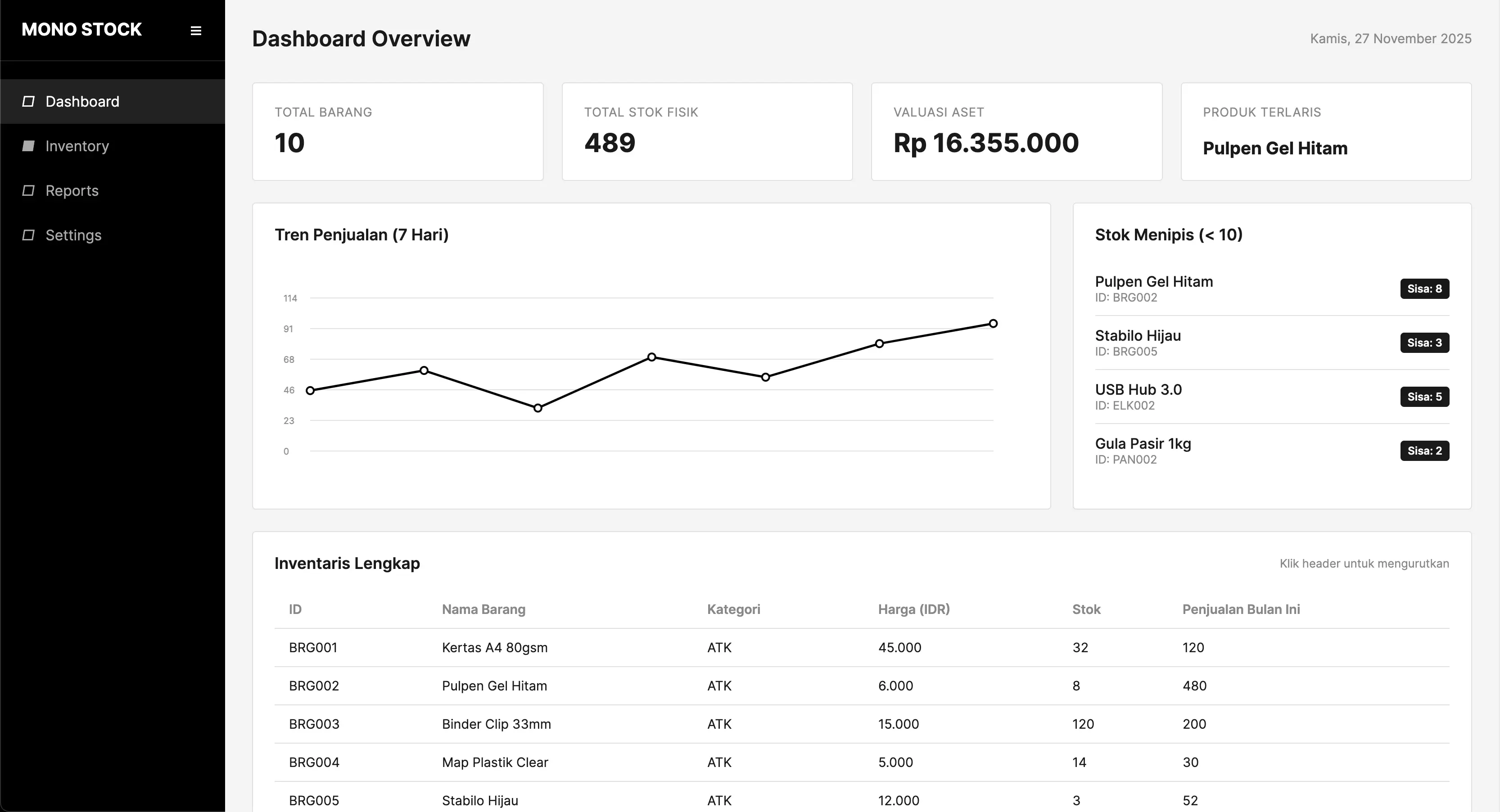
MONO STOCK TERMINAL
A monochromatic, ultra high-contrast financial market terminal engineered to eliminate extraneous decorative noise and reduce visual decision fatigue during high-volatility trading sessions.
Product Designer
Design System & Data Architecture
4 Weeks
Research → Prototyping
Desktop Web App
Multi-Monitor Trading Console
Eye Fatigue Reduction
Day traders reported significantly less ocular strain over 8-hour trading shifts.
Execution Feedback
Instant tactile state confirmation on buy and sell limit triggers.
Dark Mode Preference
Selected as primary theme to eliminate ambient glare during market opens.
Gratuitous Gradients
Pure data hierarchy: only critical price breaks utilize accent highlighting.
THE HYPER-COLORFUL TRADING COCKPIT TRAP
Modern fintech trading platforms resemble pinball machines: bright rainbow charts, flashing red and green tickers, and dozens of competing notifications. In high-stress markets, this chromatic overload triggers severe decision fatigue, causing traders to miss genuine anomalies.
Design Philosophy: When Everything Shouts, Nothing is Heard
Mono Stock establishes a rigorous monochromatic foundation. Grayscale grids and neutral typography form 95% of the interface. Only critical market breakouts utilize single-color accents, ensuring that when color speaks, the user reacts immediately.