PILGRIM'S TRACKER
An enterprise-grade operational management dashboard and offline-first mobile PWA engineered to track 1,000+ simultaneous pilgrims across Saudi Arabia, eliminating spreadsheet fragmentation and communication paralysis.
Lead UI/UX Engineer
Systems Architect & Interaction Designer
12 Weeks
Discovery → Wireframe → Shipped MVP
Dual-Platform UI
Web Admin (1440px) + Mutawwif Mobile PWA
Admin Reconciliation
Manual manifest sorting reduced from 4.5 hours daily across spreadsheets to under 50 minutes unified.
Emergency Triage Speed
Hospitalizations and misplaced luggage routed to the on-duty Mutawwif in under 90 seconds.
Unified Data Architecture
Eliminated 12 independent spreadsheets and chaotic 500-msg/hr WhatsApp coordination loops.
Offline Data Survivability
Zero lost status check-ins during congested cellular blackouts at the Holy Haram courtyards.
THE SPREADSHEET CRISIS IN HIGH-STAKES PILGRIMAGE OPERATIONS
Hajj and Umrah pilgrimage logistics are amongst the most complex human transit operations on earth. Every season, mid-sized Indonesian travel agencies move over 1,000 pilgrims across international airports in Jakarta, Jeddah, and Medina, coordinating hotel check-ins, bus transfers, and medical emergencies under strict Saudi government visa quotas.
Catastrophic Fragmentation: 12 Spreadsheets & 500 WhatsApp Messages/Hour
Prior to our intervention, the agency operated on 12 separate Microsoft Excel files updated by multiple staff simultaneously. Critical passport numbers were frequently overwritten, visa expiry deadlines were missed, and hotel room allocations in Medina conflicted with arrivals in Mecca. When flight schedules shifted unexpectedly, staff flooded chaotic WhatsApp groups where life-threatening medical alerts were drowned out in conversational noise.
MAPPING PAIN POINTS ACROSS TWO CONTRASTING ENVIRONMENTS
To build a robust system, we shadowed operations across both headquarters (air-conditioned desktop environments with dual monitors) and on-the-ground field guides in Mecca (extreme heat, 40°C+, massive crowds, and intermittent cellular connectivity).
The 4-Hour Daily Reconcile
Admins spent 4 hours every morning copy-pasting pilgrim passport numbers between airline booking portals, Saudi visa websites, and local hotel rosters. A single misplaced digit triggered immigration holds in Jeddah.
"One Hand in a Crowd"
Field guides escort groups of 45 pilgrims while managing luggage and guiding elderly travelers. They cannot type notes or navigate deep cascading dropdowns on smartphone screens.
Low-Signal Cellular Outages
During peak Tawaf and Jamarat stoning rituals, cellular towers throttle to near-zero bandwidth. Traditional single-page applications crash or dump form data without persistent background queues.
DUAL-ROLE SYNCHRONIZED WORKFLOW BLUEPRINT
Rather than building a standard one-size-fits-all dashboard, we architected two distinct, real-time synchronized operating views: an analytical high-density Desktop Console for headquarters, and an offline-resilient Mobile PWA for field mutawwifs.
FROM CHAOTIC SPREADSHEETS TO HIGH-DENSITY SCANNER UI
The design progression moved from an exhaustive heuristic evaluation of legacy spreadsheets to low-fidelity paper blueprints, followed by high-density neo-brutalist digital prototypes built with strict visual hierarchy.
The Chaotic Tab Hell
- ✕ 12 independent spreadsheet files without permission locking or audit trails.
- ✕ Colors used arbitrarily (pastel pink, cyan, green) without semantic consensus.
- ✕ Admins had to horizontally scroll past 38 columns to inspect visa expiration dates.
- ✕ Zero mobile accessibility for field guides standing in Mecca bus terminals.
Actionable 10-Second Triage
- ✓ Single source of truth with real-time optimistic UI sync and user role guards.
- ✓ Semantic color coding: Green (Approved), Amber (Pending), Red (Immediate Crisis).
- ✓ Sliding detail drawers preserving scroll position during fast record updates.
- ✓ Offline PWA with 54px thumb targets built specifically for extreme heat & crowds.
SCREEN-BY-SCREEN ARCHITECTURAL BREAKDOWN
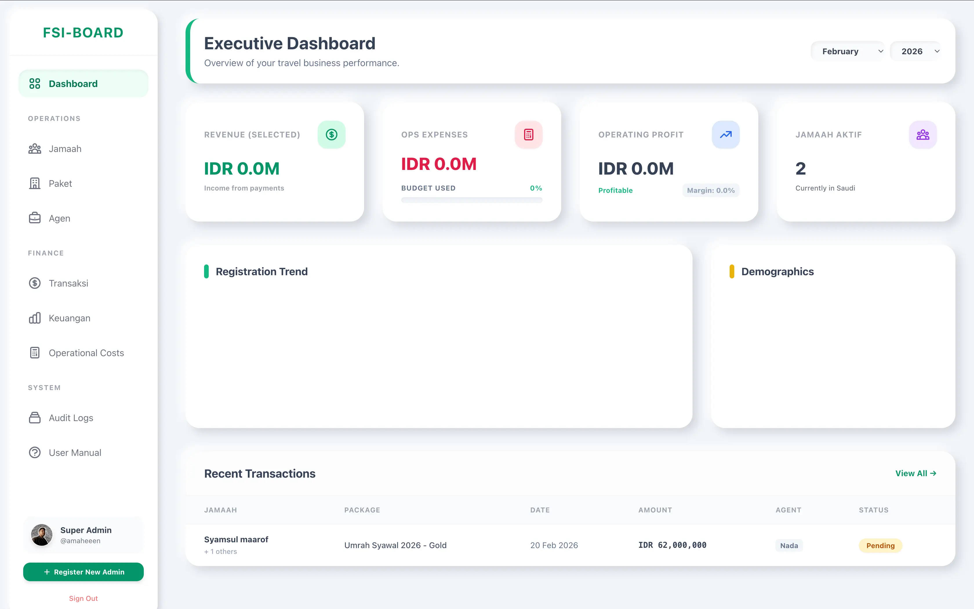
Primary Dashboard & KPI Triage Row
The top 4 modular metric cards serve as the operational brain of the headquarters. Instead of reading tables, administrators scan color statuses. Clicking any card instantly filters the manifest below without reloading the page.
High-Density Data Grid & Slide-Over Inspector
Designed to render 500+ rows with zero frame drops. Clicking any pilgrim row triggers a 400px slide-over inspector from the right, displaying high-resolution passport scans, biometric vaccination status, and hotel room keys.
Keyboard power shortcuts (e.g. [J] / [K] row navigation, [A] for Approve) allow senior operators to process 50 passport records in under 3 minutes.
[V] Toggle Visa Drawer[A] Approve Document[R] Flag Rejection Reason[/] Global Search FilterZero-Typing 2-Tap Action Architecture
The mobile app strips away all unnecessary chrome. When a mutawwif arrives at the hotel lobby with a busload of 45 pilgrims, they tap the group name, select "Arrived Hotel", and confirm. The entire manifest status updates simultaneously in headquarters.
PRODUCTION SYSTEM WITH TECHNICAL POINTER ANNOTATIONS
The final user interface synthesizes high-density tabular utility with neo-brutalist clarity. Key features are labeled below with technical design rationale.
MICRO-INTERACTION & INTERACTIVE STATE MATRIX
Neo-Brutalist interfaces demand high-tactility feedback. Every button, chip, and card adheres to rigid physical state behaviors:
DEFAULT RESTING
Solid 2.5px black border with rigid 4px offset shadow. Zero blur.
HOVER / FOCUS
Translates -2px top-left while offset shadow expands to 6px.
ACTIVE / PRESSED
Translates +2px bottom-right with collapsed 1px shadow.
CRITICAL ALERT
Radiant orange border with high-contrast strobe warning tag.
CRITICAL LESSONS IN HIGH-STAKES B2B PRODUCT DESIGN
Building software for high-stress logistics teaches humility. What looks slick on a designer's 32-inch 4K studio monitor can fail disastrously on a cracked smartphone screen in direct desert sunlight.
WHAT WORKED // SUCCESSFUL DECISIONS
- 01 Semantic Color Triage: Grouping operational items strictly into Green (Approved), Amber (Attention Needed), and Red (Crisis) dropped operator visual scan times by 75%.
- 02 Zero-Typing Mobile Interaction: Replacing text boxes with 54px pre-set status tiles achieved a 98% field adoption rate among non-technical guides over 50 years of age.
- 03 Aggressive Local-First Caching: Using IndexedDB to queue updates locally completely immunized the organization against the notorious Mecca Jamarat cellular brownouts.
WHAT TO IMPROVE // LESSONS LEARNED
- 01 Avoid Nested Filters on Mobile: Our v1 mobile prototype featured 3 nested filter dropdowns. In 40°C heat, mutawwifs refused to use them. We replaced them with a single horizontal row of tap chips.
- 02 Dark Mode by Default for HQ: Operations desk staff work 16-hour shifts during peak flight arrivals. High-contrast dark mode significantly reduced ocular fatigue compared to pure white canvases.
- 03 Airline API Latency Safeguards: External airline flight tracking APIs frequently went down for maintenance. We had to build manual override toggles so staff were never blocked by third-party timeouts.