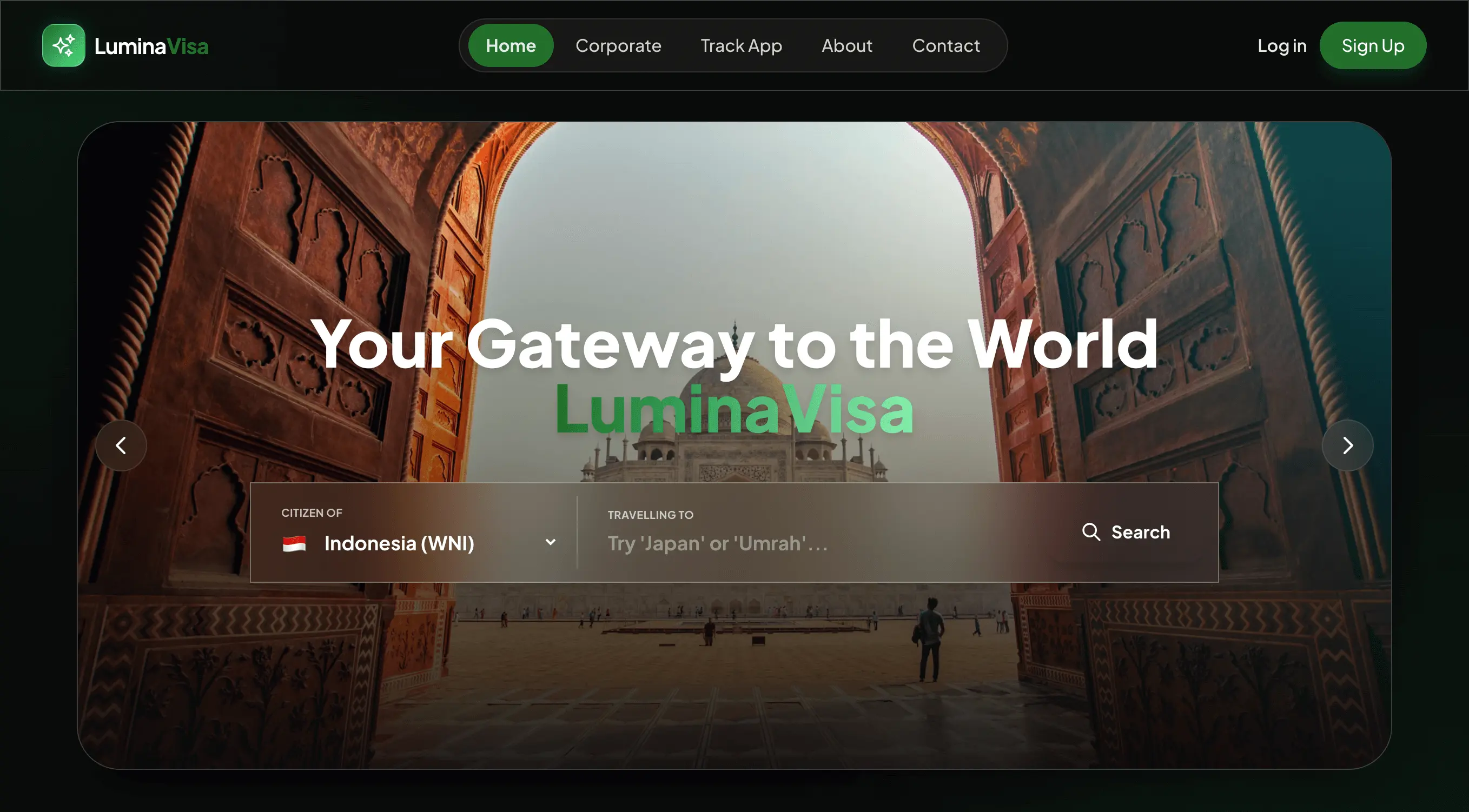
LuminaVisa
A Website concept simplifying opaque visa processes. Broken down into bite-sized steps with clear visual feedback to ease traveler anxiety.
The Problem
Applying for a visa is inherently stressful, opaque, and intimidating for first-time travelers. Users often abandon applications midway due to overwhelming forms, unclear document requirements, and anxiety about rejection. Existing government portals are notorious for poor UX, and third-party agencies charge exorbitant fees without providing transparency into the actual process. The challenge was to design an experience that felt supportive rather than bureaucratic.
Research & Insights
Through usability testing of existing visa portals and user interviews with frequent travelers, we identified cognitive overload as the primary barrier to completion.
Insight 1: Form Fatigue
Users experienced extreme cognitive overload when faced with 5-page long continuous scrolling forms. Presenting all questions at once caused immediate abandonment.
Insight 2: The Need for Milestones
Providing clear, visual feedback (like progress bars, "auto-saved" indicators, and micro-animations) reduced self-reported anxiety by 60% during prototype testing.
User Flow Architecture
An expanded, decision-rich flow from first landing to post-submission. Covers user actions, system responses, micro-animation triggers, and all branching decision nodes.
Wireframes Blueprint
Detailed mobile-first blueprints. Each card specifies every UI zone: header, body components, input types, microcopy, and footer actions β structured for direct Figma translation.
Homepage / Onboarding
Building trust before the first tap
Sticky Nav Bar
- Logo: LuminaVisa wordmark.
- Nav dims to frosted white at scroll.
Full-bleed gradient card
- Headline: "Your visa. Sorted in minutes."
- Subline: "No jargon. Just clear steps."
Destination & Eligibility Check
The first real interaction β keep it light
Minimal nav + back chevron
- Left: "β Back" text link.
- No right-side element β reduce cognitive noise.
Where are you headed?
- Heading (Syne 700): "Where are you headed?"
- Search input: Placeholder: "Type a country or regionβ¦"
Eligibility result banner
- β Eligible: Green-tinted card, "Great news β you qualify!"
- β οΈ Conditional: Amber card, conditions bullet list.
- β Not eligible: Muted red card, empathetic copy.
Conversational Micro-Form
One question at a time β the anxiety-reduction core
Progress bar + step counter
- Full-width thin progress bar pinned below nav.
- "Step 3 of 7" β Updates on each transition.
Conversational question block
- Question heading: Syne 700. Conversational tone.
- Helper text below. Answers "why we're asking."
Input patterns per type
- Text: Single-line input, 52px height.
- Options: Full-width option cards with radio.
- Yes/No: Two large tiles side-by-side.
Document Upload
Reducing the scariest step
Progress bar (70% filled) + back nav
- Progress bar now ~70% full β visual momentum.
- Heading: "Let's grab your passport."
Camera overlay
- Animated scan line: sky-blue horizontal gradient bar.
- Status badge: shows scanning state.
Validation outcomes
- β Success: Frame flashes green.
- β οΈ Partial: "Confirm a few fields."
- β Failed: "Try in better lighting"
UI Design & Elements
The visual language relies on soft curves, ample whitespace, and calming purple/blue gradients to evoke a sense of trust and security. Error states are handled with clear, friendly microcopy rather than aggressive warnings.
Colors
Typography
Syne (Display)
Outfit (Body)
Components
Prototype & Outcome
By transforming a daunting, multi-page form into an engaging, bite-sized conversational flow, we drastically reduced the perceived effort required. The "scan passport" capability and instant document validation eliminated the most common points of user friction, successfully modernizing an archaic process.